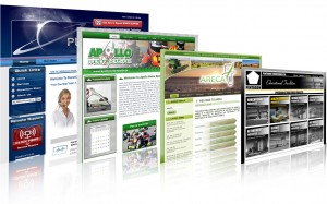
Texture plays a vital rule in overall performance of web design, and is used to add depth and dimension to an ordinary flat page. It is not a passing trend, which is just used for couple of months and then disappears in the darkness of history. The professional web designers realize its significance to draw visitor’s attention and its power to renovate a best web design into an aesthetically fascinating and effective website.
There are several ways to adding versatile textures styles to a website and proper use of texture can accomplish with limitless design goals:
- Grasp Visitor’s Attention:
Texture can be best used to mould visitor’s attention towards specific titles, call-??to-??action buttons, footers, icons, artwork, fonts, or logos. A plain logo against a textured background or a textured logo over a plain background is used for dramatic effects.
- Contrast:
Texture with various contrast are used in information boxes, sidebars, or other discrete sections of content, which make it more attractive and effective.
- Comforting Environment:
The overall look of your website is taken very seriously by the professional designers. An ideal website is not just about grapping the viewer’s attention at the first look but also to engage them for longer time. A perfect combination of versatile texture styles provides a comforting and appealing environment to visitors to keep them engage and convey the real message of your business meanwhile.
- Realistic and Natural:
Professional website designer like their pages to be appeared natural and realistic, they use water droplets, ice, plants, wood fur, or some other texture styles. This stirs up emotions in the visitor and leads them where you want them to be.
However, poorly used textures can reverse the whole effects, like too much usage of texture is also a bad approach. Therefore, always consult professional web design services to use best and gain the real outcomes out of it.
